Visualization
Tableau Blog Posts Series – Tips,Tricks,Best Practices – Blog Seven
- Visualization Importance : Position>Color>Size>Shape
- What visualization to use
- Time on an x-axis
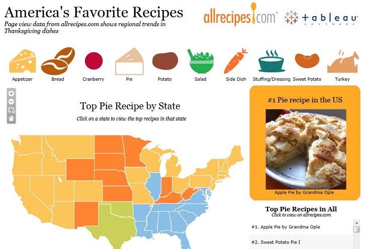
- Location on a map
- Comparing values – bar chart
- Exploring relationships – scatter plot
- Relative proportions – treemap
- 5-second test of a dashboard https://www.youtube.com/watch?v=MNh1j3BwaqQ
- Most important view goes on top or top-left
- Legends go near their views
- Avoid using multiple color schemes on a single dashboard
- Provide interactivity
- Title
- Axes
- Key facts and figures
- Units
- Remove extra digits in numbers
- Great tooltips
- Dashboard review
- 3+ reviewers, 30 mins
- Send dashboards for review ahead of time
- Test recommendations during the meeting
- Questions to ask: 1) what question does this dashboard answer? 2) Is this the best way to answer the question? 3) Does everything on the dashboard add value?
4) Is there functional interactivity? 5) Are labels, titles and legends effective? 6) Does this dashboard apply visual best practice? 7) Is this dashboard right for its audience?
- The visualization must be completely loaded into the working memory before publishing to Tableau Server/Online
- Bullet graph http://makingdatameaningful.com/2012/02/27/creating-dual-axis-bullet-graphs-with-tableau/
- Combine bars with lines http://drawingwithnumbers.artisart.org/bars-and-lines/
- Treemap barchart http://tableaulove.tumblr.com/post/40257187402/fun-with-tableau-treemap-visualizations
- Stream graphs http://vizwiz.blogspot.co.uk/2013/01/creating-stream-graphs-in-tableau-8-in.html
- Embed Youtube videos http://dataremixed.com/2013/04/embedding-youtube-videos-in-tableau/
- Add Tableau to PowerPoint http://vizwiz.blogspot.co.uk/2012/10/tableau-tip-embedding-dynamically.html
- Network graph http://www.clearlyandsimply.com/clearly_and_simply/2012/12/build-network-graphs-in-tableau.html
- Radar chart http://duelingdata.blogspot.com/2013/07/radar-chart-vs-parallel-coordinate-chart.html
- Waffle chart http://tableaulove.tumblr.com/post/56368410545/yummy-yummy-tableau-waffle-charts-from-jesse-gebhardt
- Jitter chart http://www.datarevelations.com/ive-got-the-jitters-and-i-like-it.html
- Boxes, Whiskers, and Jitters http://www.datarevelations.com/boxes-whiskers-and-jitters.html
- Multiple small maps http://dataremixed.com/2014/09/how-to-make-small-multiple-maps-in-tableau/
- Slope chart http://gravyanecdote.com/tableau/how-to-make-a-slope-chart-in-tableau/
- Another version of scatterplot http://www.datarevelations.com/likert-vs-likert-on-a-scatterplot.html
- Rank_Dense http://mixpixviz.blogspot.co.uk/2014/09/you-rank-and-soooo-dense.html
- Circle http://mmviz.blogspot.co.uk/2014/09/think-outside-box.html
- Bar, pie, sankey charts http://www.datarevelations.com/circles-labels-colors-legends-and-sankey-diagrams-ask-these-three-questions.html
- Images http://www.theinformationlab.co.uk/2014/08/21/using-images-tableau/
- Tableau and google map http://thevizioneer.blogspot.com/2014/08/tableau-and-google-maps-finally-friends.html
- Sparkline http://www.datarevelations.com/sparklines-schmarklines.html
- Create color palette http://vizcandy.blogspot.co.uk/2014/02/10-steps-to-color-in-tableau.html
- Band lines http://vizwiz.blogspot.co.uk/2014/02/tableau-tip-make-great-looking-band.html
- Visualize survey data http://www.datarevelations.com/visualizing-survey-data
- http://www.datavizualization.com/blog/beyond-the-visualization-zoo
- Custom shape https://www.interworks.com/blogs/ccapitula/2015/01/16/tableau-essentials-formatting-tips-custom-shapes
- Timeline https://www.interworks.com/blogs/rrouse/2014/11/12/designing-classic-timeline-tableau
- Cohort analysis http://kb.tableausoftware.com/articles/knowledgebase/cohort-analysis-tips https://www.youtube.com/watch?v=Lu1g8B9Y4Hs https://www.interworks.com/blogs/jkhalaj/2015/03/16/cohort-analysis-tableau-user-retention-given-only-created-and-last-seen-dates http://drawingwithnumbers.artisart.org/tag/cohort-analysis/ http://www.waterloodata.com/main/cohort-analysis-and-tableau/

